How to Create a Bar Chart in Tableau: A Step-by-Step Guide for Beginners
Data visualization is one of the strongest skills you can build as a beginner in analytics—and Tableau makes it surprisingly easy. Among all chart types, Bar Charts are the simplest and most effective for comparing values across categories.
In this guide, you’ll learn how to create a bar chart in Tableau step by step, using an example dataset.
Why Use a Bar Chart in Tableau?
Before jumping into the steps, it’s helpful to know why bar charts are so popular:
-
Easy to interpret
-
Great for comparing categories
-
Useful for showing trends or highlighting high/low performers
-
Flexible (horizontal, vertical, stacked, grouped, etc.)
Want to learn more Tableau charts? Check out our full Tableau course here → Learn Tableau
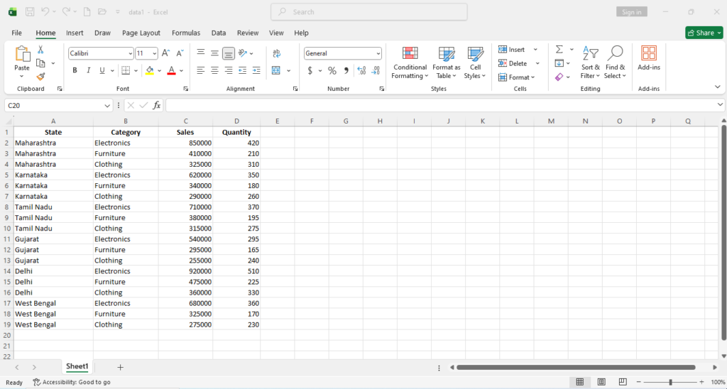
🔹 Sample Dataset
To follow along, imagine you have a simple dataset like this. Keep this sample in Excel and import it into Tableau.
📝 Step-by-Step: Create a Bar Chart in Tableau
Step 1: Open Tableau and Connect Your Data
-
Launch Tableau Desktop or Tableau Public.
-
On the start page, click “Microsoft Excel.”
-
Browse and select your Excel file (the one containing the above dataset).
-
Tableau will load the file and show the sheet in the Data Source tab.
Step 2: Drag Fields to Rows and Columns
-
Go to Sheet 1.
-
In the left sidebar (Data Pane):
-
Drag Category → Columns
-
Drag Quantity →Rows
-
Immediately, Tableau will create a vertical bar chart.
Step 3: Add Labels
Labels help users immediately see values without hovering.
-
Drag Quantity on Label on Marks Pane.
Now the quantities will appear on the bars.
If you enjoyed this tutorial, my complete Tableau course covers dashboards, KPIs, filters, parameters and real-time business projects.
👉 Enroll Here Learn Tableau
Step 4: Change Bar Width
You can change or adjust thw width or thickness of the bar.
On Marks Pane click on “Size” -> adjust the size accordingly as shown below
Now if you want to make sepecific gap between the bars then you can:
Hold and drag “Category” fro x-axis and adjust size from marks pane as shown below.
Step 5: Add Colors (Optional but Recommended)
To make the chart pop:
- Choose a color from color palette from Marks → Color
This improves visual clarity.
If you enjoyed this tutorial, my complete Tableau course covers dashboards, KPIs, filters, parameters and real-time business projects.
👉 Enroll Here Learn Tableau
Step 6: Formatting X-axis Category(Optional)
Right click on x-axis-> format- > now change font size, color, style as shown below
Step 7: Formatting Y-axis Quantity(Optional)
Right click on y-axis-> format- >Axis-> now change font size, color, style as shown below
Go Pane-> now change font size, color, style to change the font style of Labels above the bar chart as shown below
Step 8: Add Color to the Sheet
If you want to change the whole sheet’s background:
-
Go to the worksheet.
-
Right-click anywhere blank on the worksheet.
-
Click Format.
-
In the Format pane (left side), choose the Shading tab (paint bucket icon).
-
Under Worksheet, change the background color.
This changes the entire sheet background.
If you enjoyed this tutorial, my complete Tableau course covers dashboards, KPIs, filters, parameters and real-time business projects.
👉 Enroll Here Learn Tableau
Step 9: Add a Title
-
Double-click at the top of the sheet.
-
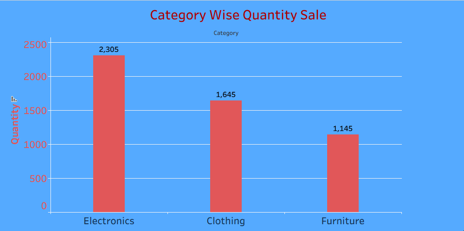
Enter: “Category Wise Quantity Sale”
- Do formatting as per your requirement
-
Click Apply->OK.
Step 10: Sort the Bars for Better Readability
-
Click the Sort icon (descending/ascending arrows) as shown below
Or,
-
You can also right-click the axis → Sort.
Sorting helps users quickly identify the highest and lowest values.
If you enjoyed this tutorial, my complete Tableau course covers dashboards, KPIs, filters, parameters and real-time business projects.
👉 Enroll Here Learn Tableau
Step 11:Switch Rows and Columns in Tableau
Use the Swap Button (Most Common)
-
Look at the top of the view (toolbar)— you’ll see an icon with Swap between Rows and Columns.
-
Click the Swap button.
This will instantly swap whatever is in Rows with Columns, and vice-versa.
Step 12: Save
-
If using Tableau Public → click Save to Tableau Public.
-
If using Tableau Desktop → File → Save As.
Final Output
You will have a clean bar chart showing each product category compared by quantity sale.
If you like the content submit your valuable comment in the comment section.
Join our Tableau Course Online/ Oflline Now
 Call/WhatsApp: 9903230400 / 9836588101
 Website: www.thestudysolution.in